Bootstrap Table Css
Overview
Tables are present in almost all apps (web, desktop or mobile application) and they are a important element in showing records to the final user. The HTML tables are actually used to present material in framework manner like rows and columns . With using Bootstrap 4 framework you are capable to easily improve the appeal of the table.
In the present day, with the importance that the user interface has, understanding the way to increase the appeal of a Bootstrap Table Responsive becomes as relevant as it is. In this scenario, one of the technologies that have come to be reference is Bootstrap. This front-end framework, along with lots of other features , gives a variety of functions for styling and optimising the display of different elements, such as tables.
Basic table in Bootstrap
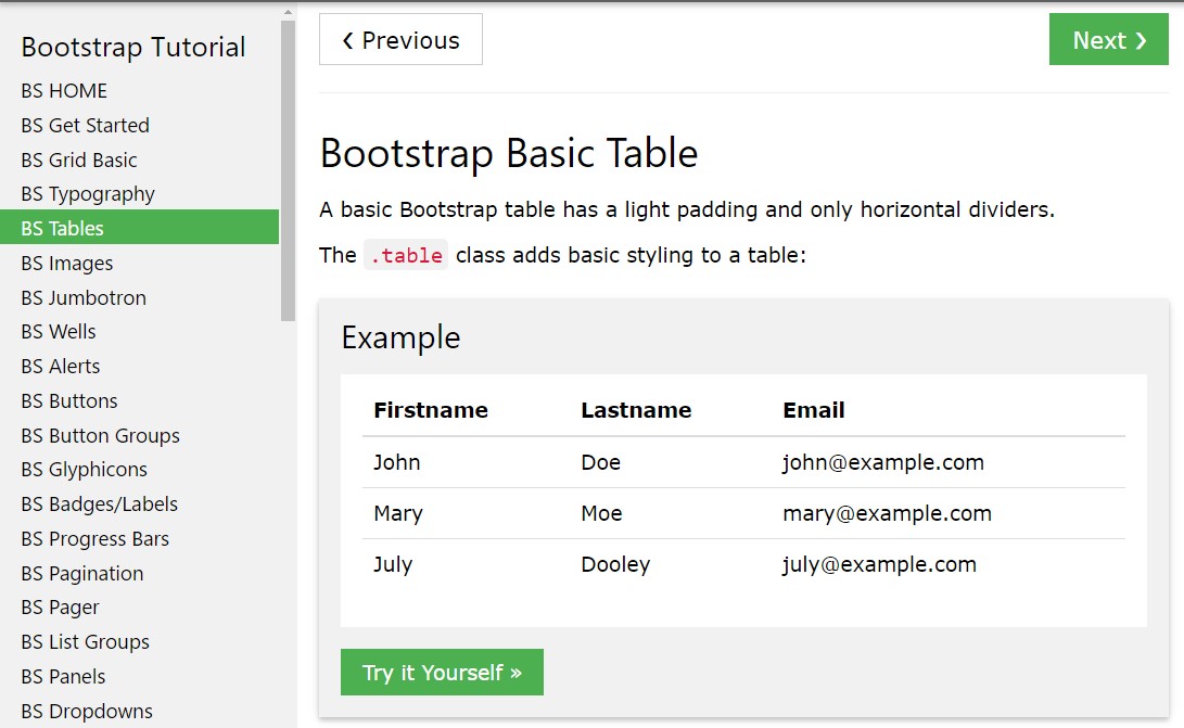
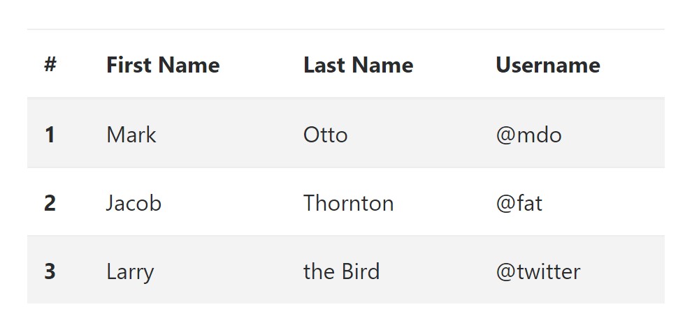
To format a table using Bootstrap, just include the table class to the <table> tag, and certain visual format will actually be applied , as shown on the screenshot .
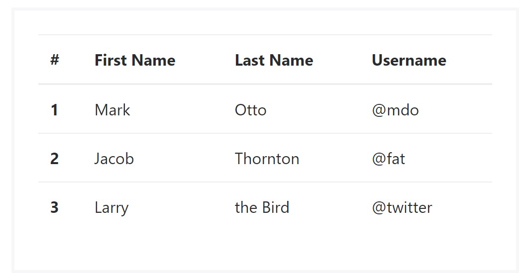
<table class="table">
  <thead>
    <tr>
      <th>#</th>
      <th>First Name</th>
      <th>Last Name</th>
      <th>Username</th>
    </tr>
  </thead>
  <tbody>
    <tr>
      <th scope="row">1</th>
      <td>Mark</td>
      <td>Otto</td>
      <td>@mdo</td>
    </tr>
    <tr>
      <th scope="row">2</th>
      <td>Jacob</td>
      <td>Thornton</td>
      <td>@fat</td>
    </tr>
    <tr>
      <th scope="row">3</th>
      <td>Larry</td>
      <td>the Bird</td>
      <td>@twitter</td>
    </tr>
  </tbody>
</table>
Inverse tables.
One of the new tables in Bootsrap 4 is the inverse tables. Class .table-inverse can restyle the colouring of the table.
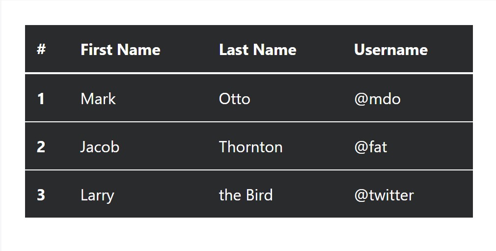
<table class="table table-inverse">
  <thead>
    <tr>
      <th>#</th>
      <th>First Name</th>
      <th>Last Name</th>
      <th>Username</th>
    </tr>
  </thead>
  <tbody>
    <tr>
      <th scope="row">1</th>
      <td>Mark</td>
      <td>Otto</td>
      <td>@mdo</td>
    </tr>
    <tr>
      <th scope="row">2</th>
      <td>Jacob</td>
      <td>Thornton</td>
      <td>@fat</td>
    </tr>
    <tr>
      <th scope="row">3</th>
      <td>Larry</td>
      <td>the Bird</td>
      <td>@twitter</td>
    </tr>
  </tbody>
</table>
Additional classes
For tables there are also some classes that make it possible for you to use various designs to a table, they are:
● table-striped Toggles the color tone of table rows;
● table-bordered Adds border to table;
● table-hover Switches on the highlight of a Bootstrap Table Pricing line when we hover the mouse cursor over it;
● table-condensed Reduces the height of table rows, making it more compact.
To add all of these designs, just add the desired classes to the: <table>: <table class="table table-striped table-bordered table-condensed table-hover">
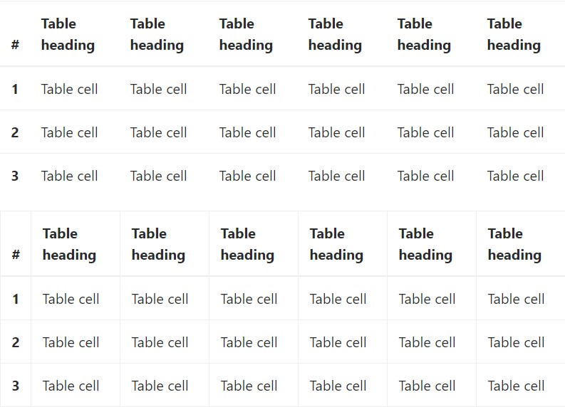
Table head opportunities
Like default and inverse tables, work with one of two modifier classes to make <thead> appear dark or light gray.
img
<table class="table">
  <thead class="thead-inverse">
    <tr>
      <th>#</th>
      <th>First Name</th>
      <th>Last Name</th>
      <th>Username</th>
    </tr>
  </thead>
  <tbody>
    <tr>
      <th scope="row">1</th>
      <td>Mark</td>
      <td>Otto</td>
      <td>@mdo</td>
    </tr>
    <tr>
      <th scope="row">2</th>
      <td>Jacob</td>
      <td>Thornton</td>
      <td>@fat</td>
    </tr>
    <tr>
      <th scope="row">3</th>
      <td>Larry</td>
      <td>the Bird</td>
      <td>@twitter</td>
    </tr>
  </tbody>
</table>

<table class="table">
  <thead class="thead-default">
    <tr>
      <th>#</th>
      <th>First Name</th>
      <th>Last Name</th>
      <th>Username</th>
    </tr>
  </thead>
  <tbody>
    <tr>
      <th scope="row">1</th>
      <td>Mark</td>
      <td>Otto</td>
      <td>@mdo</td>
    </tr>
    <tr>
      <th scope="row">2</th>
      <td>Jacob</td>
      <td>Thornton</td>
      <td>@fat</td>
    </tr>
    <tr>
      <th scope="row">3</th>
      <td>Larry</td>
      <td>the Bird</td>
      <td>@twitter</td>
    </tr>
  </tbody>
</table>
Striped rows
Zebra-like stripes may be brought in with the .table-striped class, an good example
<table class="table table-striped">
  <thead>
    <tr>
      <th>#</th>
      <th>First Name</th>
      <th>Last Name</th>
      <th>Username</th>
    </tr>
  </thead>
  <tbody>
    <tr>
      <th scope="row">1</th>
      <td>Mark</td>
      <td>Otto</td>
      <td>@mdo</td>
    </tr>
    <tr>
      <th scope="row">2</th>
      <td>Jacob</td>
      <td>Thornton</td>
      <td>@fat</td>
    </tr>
    <tr>
      <th scope="row">3</th>
      <td>Larry</td>
      <td>the Bird</td>
      <td>@twitter</td>
    </tr>
  </tbody>
</table>
Hover Rows
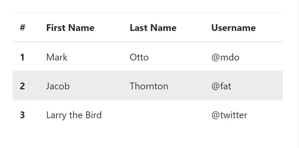
To create a hover side effect in the rows of your table include the .table-hover class:
<table class="table table-hover">
  <thead>
    <tr>
      <th>#</th>
      <th>First Name</th>
      <th>Last Name</th>
      <th>Username</th>
    </tr>
  </thead>
  <tbody>
    <tr>
      <th scope="row">1</th>
      <td>Mark</td>
      <td>Otto</td>
      <td>@mdo</td>
    </tr>
    <tr>
      <th scope="row">2</th>
      <td>Jacob</td>
      <td>Thornton</td>
      <td>@fat</td>
    </tr>
    <tr>
      <th scope="row">3</th>
      <td colspan="2">Larry the Bird</td>
      <td>@twitter</td>
    </tr>
  </tbody>
</table>
Bordered Table
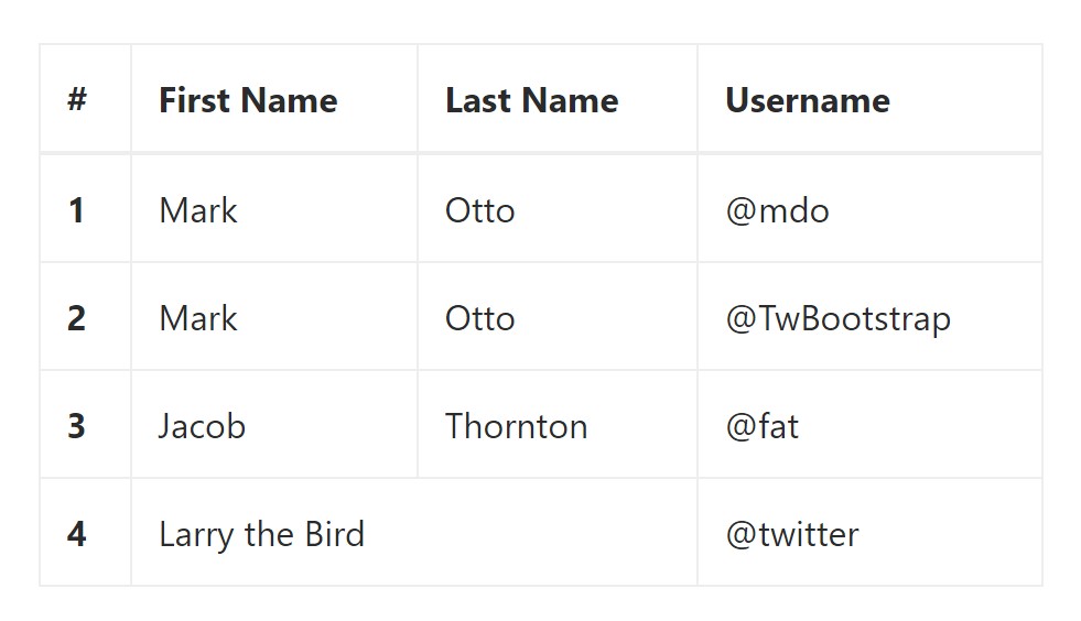
You have the ability to bring in the borders on each and every table slide and a cell with the .table-bordered class:
<table class="table table-bordered">
  <thead>
    <tr>
      <th>#</th>
      <th>First Name</th>
      <th>Last Name</th>
      <th>Username</th>
    </tr>
  </thead>
  <tbody>
    <tr>
      <th scope="row">1</th>
      <td>Mark</td>
      <td>Otto</td>
      <td>@mdo</td>
    </tr>
    <tr>
      <th scope="row">2</th>
      <td>Mark</td>
      <td>Otto</td>
      <td>@TwBootstrap</td>
    </tr>
    <tr>
      <th scope="row">3</th>
      <td>Jacob</td>
      <td>Thornton</td>
      <td>@fat</td>
    </tr>
    <tr>
      <th scope="row">4</th>
      <td colspan="2">Larry the Bird</td>
      <td>@twitter</td>
    </tr>
  </tbody>
</table>
Short Table
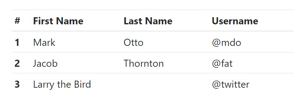
In case you like to make your table more compact - on that occasion you can cut cell padding in half by having this class: .table-condensed.
Bear in mind that, while Bootstrap 4 uses .table-sm to condense a table, Bootstrap 3 uses .table-condensed. Both equally cut cell padding in half.
<table class="table table-sm">
<thead>
<tr>
<th>#</th>
<th>First Name</th>
<th>Last Name</th>
<th>Username</th>
</tr>
</thead>
<tbody>
<tr>
<th scope="row">1</th>
<td>Mark</td>
<td>Otto</td>
<td>@mdo</td>
</tr>
<tr>
<th scope="row">2</th>
<td>Jacob</td>
<td>Thornton</td>
<td>@fat</td>
</tr>
<tr>
<th scope="row">3</th>
<td colspan="2">Larry the Bird</td>
<td>@twitter</td>
</tr>
</tbody>
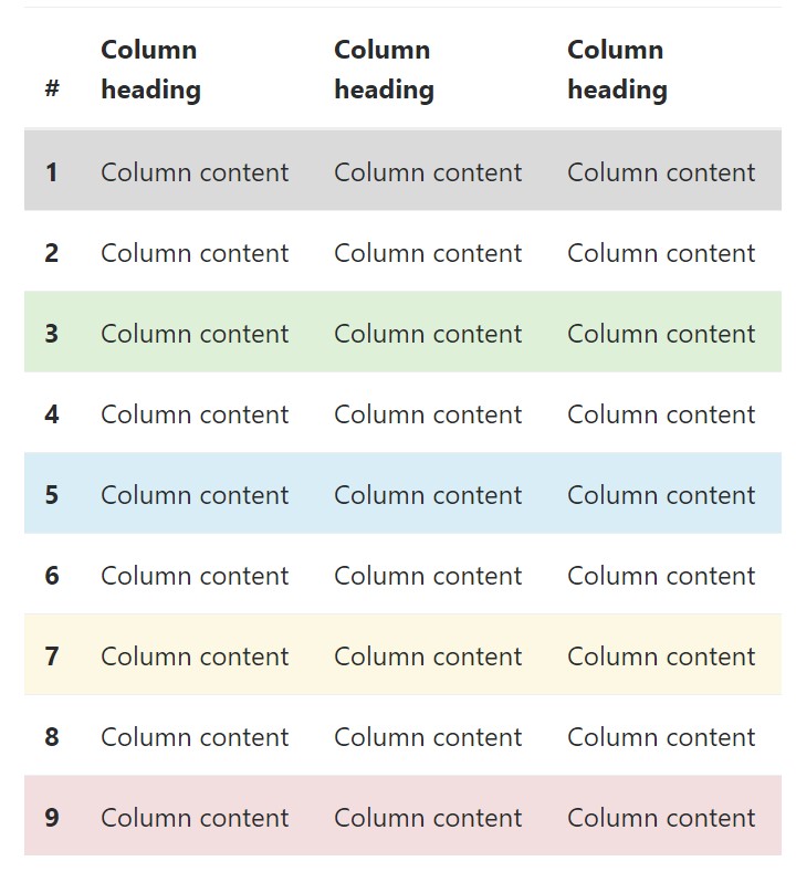
</table>Contextual Classes of Bootstrap Table Css
Use the contextual classes to color a table cells (<td>) and table rows (<tr>):
<!-- On rows -->
<tr class="table-active">...</tr>
<tr class="table-success">...</tr>
<tr class="table-warning">...</tr>
<tr class="table-danger">...</tr>
<tr class="table-info">...</tr>

<!-- On cells (`td` or `th`) -->
<tr>
  <td class="table-active">...</td>
  <td class="table-success">...</td>
  <td class="table-warning">...</td>
  <td class="table-danger">...</td>
  <td class="table-info">...</td>
</tr>
Changing the rows of a table Bootstrap 3 does not use the .table- prefix for its contextual classes. As some example, Bootstrap 3 uses .active whereas Bootstrap 4 uses .table-active. Other than that, each of the versions work with the same 5 contextual key words (active, success, info, warning, danger). Below you can see the information of each and every one possible option:
● active: Applies the focus colour to the table row or table cell
● success: Indicates a positive or successful action
● info: Indicates a neutral information change or action
● warning: Signifies a notice that you might need attention
● danger: Displays a dangerous or potentially negative action
Responsive Tables
To create a responsive table - use the .table-responsive class. Table scrolls in the horizontal position on devices that less than 768px. If the gadget is larger sized than 768px wide, then you will see no difference :
Bootstrap 4 allows you to add the .table-responsive class to the actual <table> element. Bootstrap 3 tables required that you add that class to a parent <div> element.
Review a number of on-line video tutorials about Bootstrap 4 tables
Related topics:
Bootstrap tables: official documentation
W3schools:Bootstrap table tutorial